3D Transforms were born in 2009 when the WebKit development team made the initial proposal. It was soon implemented in Safari (for Mac) and was later also added to Chrome and Android in 2011. By now, Microsoft (IE10) and Firefox do support 3D Transform properties as well. In order to get an overview of supported 3D Transform features have a look at caniuse.
CSS 3D Transformation is an extension to the CSS 2D Transformation Model, introducing a couple of additional properties.
Perspective
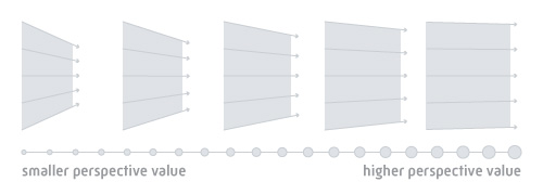
Perspective defines how the depth of the 3D scene is rendered. Values ranging from 1 to 1000 will produce a very pronounced effect, and values over 1000 less so. Think of perspective as a distance from the viewer to the object. The greater the value, the further the distance, so the less intense the visual effect. By default, the vanishing point of a 3D space is in the center of the object. This can be changed by modifying the "perspective-origin" property.
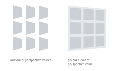
Perspective can be applied directly to the object you’re about to manipulate in 3D space or to a parent object. This can make a huge difference since the vanishing point is either defined for each object individually or unified for a group of objects if applied to a parent.
3D Transforms
3D Transforms are quite similar to what you already might know from 2D Transforms. Transforms offer a variety of properties to manipulate your object in 3D space:
- rotateX(angle)
- rotateY(angle)
- rotateZ(angle)
- translateZ(tz)
- scaleZ(sz)
Before jumping into any of those in detail you just might head over to westciv 3D Transform tools and explore the properties by playing around with the interactive tool built by westciv. A well-written article - both explaining the properties in detail while also offering an extensive introduction - can be found at 24ways.
Prefixes
One obnoxious aspect about CSS3 elements in general (and, therefore, also about 3D Transforms) are CSS prefixes. We tried to use the -prefix-free script to avoid having to use the ugly prefixes - but eventually found out that a couple of 3D properties did not work very well cross-browser-wise. So we ended up with prefixing the values by ourselves. Later, we stumbled upon GSAP’s CSSPlugin which might come in handy for future reference.
The Sidebar Ticket
In order to get an overview of the basic structure and CSS of the teaser ticket you should head over to the pen we created at Chris Coyier's excellent service CodePen. It's best to have the code open side-by-side with this article so you can follow along easily.
At it’s core, the teaser is made up of one parent and 2 child elements:
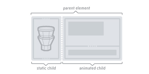
The parent element defines the basic perspective as well as overall width and height. We also added the "-webkit-backface-visibility:hidden" property. This prevents a bug which occurs in Chrome and causes a flickering of the website when animating 3D objects.
Inside the parent we nested 2 elements which basically represent the left side (which remains flat) of the ticket as well as the right side (which flips on mouseover). For easier usage and less HTTP requests we rely on a single background image instead of slicing up the image in two parts. The single background image is applied to both child elements as a background image. For pixel-precise alignment both child elements make use of "position:absolute" while the parent has "position:relative" applied. By adjusting the "background-position" of the graphics as well as absolute positions of the child elements we put the graphic together as one single piece.
The flip animation itself is defined inside the right part of the ticket. We use "transition-duration" as well as "transition-timing-function:ease" for smooth animation transitions. Finally, we simply define the flipped angle of the right part of the ticket by applying "y-rotation" when the parent container element is hovered.
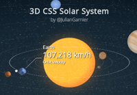
All in all the usage of 3D Transforms is quite easy assuming you target modern (standard-compliant) web browsers and opens up a wide array of creative possibilities. Here are a few examples that demonstrate interesting approaches towards 3D Transforms on CodePen. Have fun exploring!


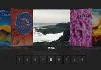

FoldScroll by Justin Windle
For further reading about CSS 3D you might also find the following articles interesting:
